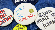
The printed word: over the last 500 years it's been a necessary tool to spread information, express ideas, and of course create internet memes. And over time typeface design has evolved from handwritten manuscripts to the eventual ease of the digital age.
Today, with the right knowledge of setting type, you can make your button convey your message in both language and design. We take a look at the Button Museum, our greatest source for inspiration for typeface styles, to see how typography has been used on pins for years.

This 1971 political pin from the National Women's Political Caucus used the slogan, "Women! Make Policy, Not Coffee" to encourage more women to seek more active roles in politics and elections. Making this message easy to read was important.
Futura, along with other geometric typefaces, denotes modernism and utility, making it the perfect candidate to delivery the NWPC's rallying cry.

Created in 1922 by Oswald Bruce Cooper, Cooper Black can be classified as an Old Style typeface—which simply means some of its characteristics can be linked back to historically used book faces.
In this variation of Cooper Black in this 1956 Kentucky Derby Festival pin, notice the added flair to the descenders of the letters "h" and "s" and the generous use of thick lines for added contrast. Both of which are common in old style lettering techniques.

Similar to the previous button, this "be a good guy" pin features a category of face that falls under a modern typography. Types that are included in this group have a stylish yet dynamic factor to them that comes from the use of thick and thin strokes. Bodoni and Didot for example are modern typefaces that were produced in the late 18th and early 19th century. Prominent names in this style of type were in Giambattista Bodoni, Firmin Didot, and Germany Justus Erich Walbaum.

Sometimes the choice of font can add another layer of irony and humor to the text! "Thou Shalt Not Hassle", a funny enough phrase itself is accompanied by the decorative script, Wilhelm Klingspor Gotisch is reminiscent of calligraphy.It's an ornamented typeface that reminds us of a hand-written quality but also has a uniformity that can be used for titles and headers.

There are some typefaces that make their own place in history! Just looking at this locking pin button, anyone can see that the "I'm an Oma!" letters are inspired by the 1968 Olympic logo design. For the world games taking place in Mexico that year, the graphic design team which included Lance Wyman, Beatrice Colle, Jose Luis Ortiz, and Jan Stornfeld, found creative influence from Opt Art of the 60s.
Just like the history of the pinback button, the history of fonts and typography can be traced back hundreds of years ago. For more inspiration for your next button project, check out the rest of our design-centered posts or subscribe to our Design Newsletter.


